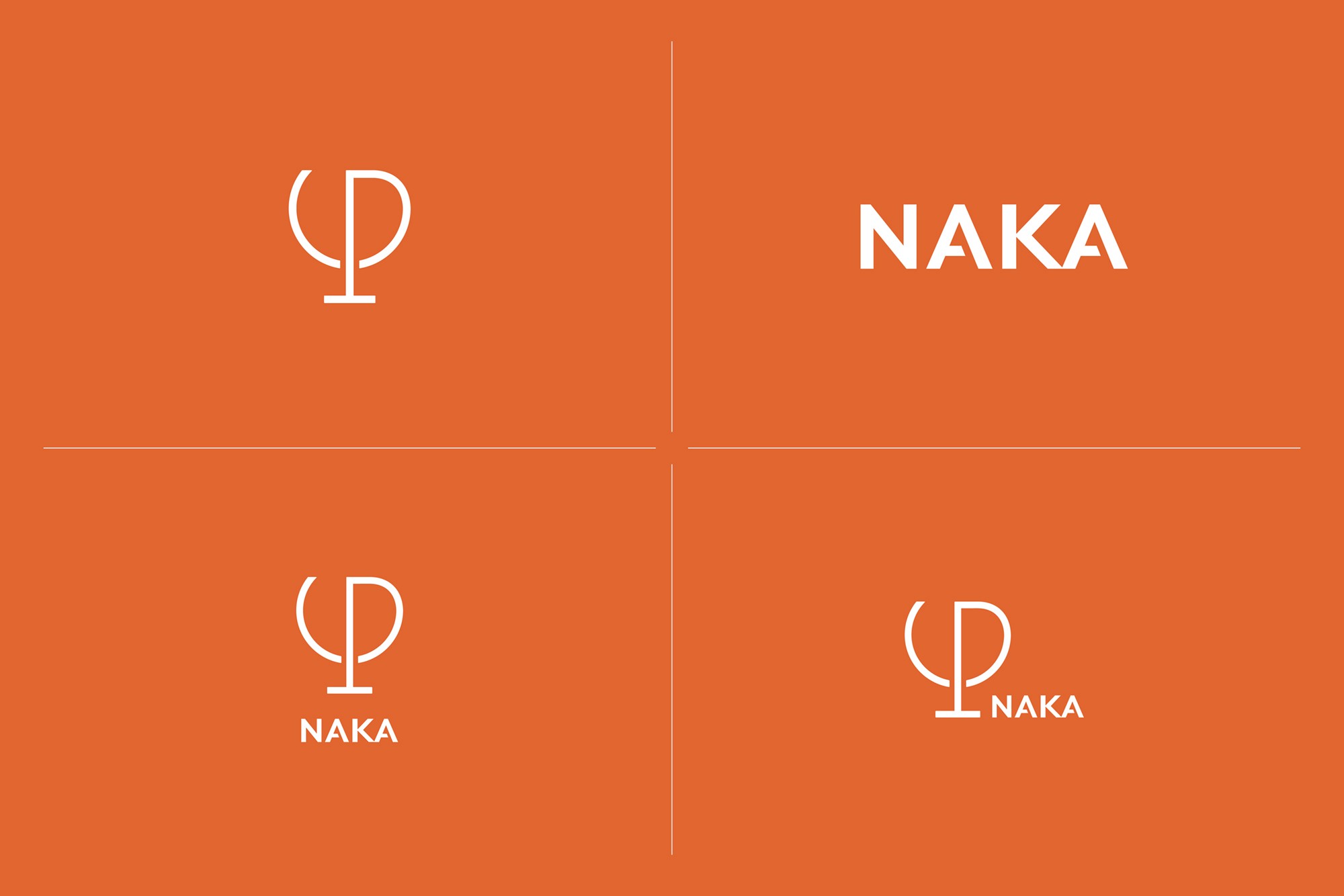
NAKA
NAKA, when pronounced as なか (naka) in Japanese, carries the meanings of "middle" and "balance". The exquisite sensation of balance, like a perfect harmony, evokes a unique response within each individual's heart.
Client
NAKA
Category
Brand Identity
Brand Strategy
Brand Guideline
Enviromental Graphics
Packaging
Sector
Beverage
Year
2023


NAKA combines traditional classic beverages with modern taste aesthetics, offering a diverse beverage culture that caters to the lifestyle in Asia. From energizing caffeine for the daytime to soothing and comforting beverages for the evening, NAKA caters to the multi-faceted beverage preferences of individuals. Our goal is to merge traditional beverage craftsmanship with advanced taste aesthetics, redefining the market for handcrafted drinks and shaping the concept of "Elite To Go" takeaway beverage stores.
NAKA believes that the essence of life could be carried within ourselves. In a city that never rests, let us take a moment to pause – Our daily lives are filled with hectic and trivial matters, suffocating us. Perhaps, we all need to take a step back and find a place to rest in this bustling city.
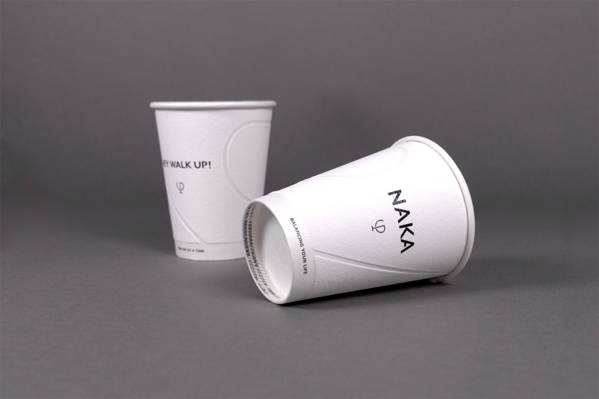


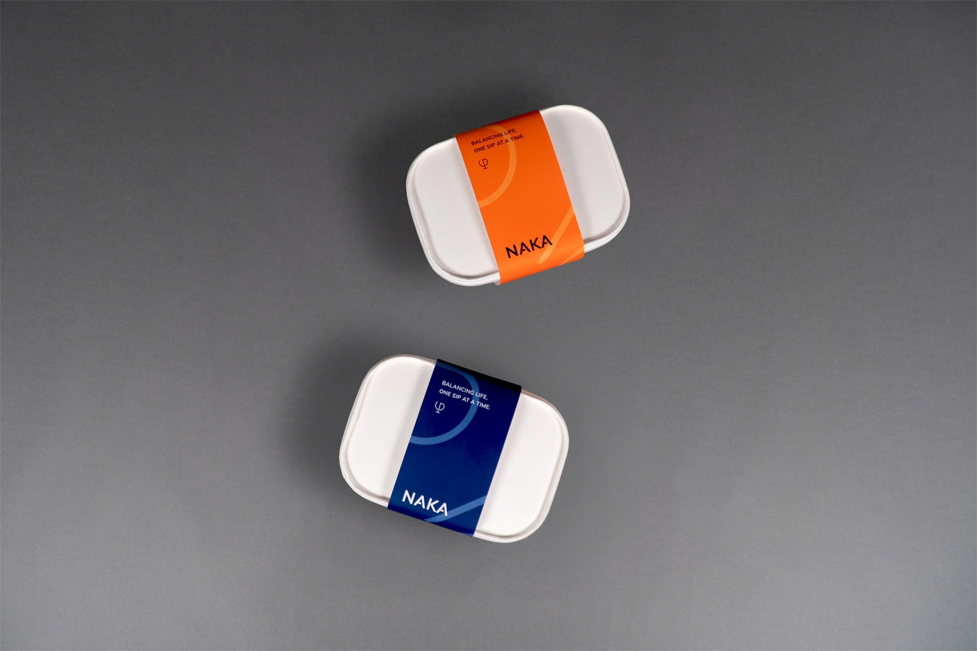
With a focus on takeaway, we created an elegant indoor space, featuring a grand counter and large glass windows that reflect the picturesque surroundings outside. Here, you can enjoy a cup of coffee or a refreshing beverage, while enjoying the outdoor drinking area, and take a deep breath, relishing a moment of respite. This single cup represents NAKA's commitment to accompany you as we embark on the journey towards the future.
Credits
Client
NAKA
Agency
Graphic Dpt
Creative Direction
Billy Cheung
Design
Yuhsuan Huang
Design
Yutung Wang
Project Management
Abby Wang
Spatial Design
事作制所 Assiduous Design
Printing
全力印刷 Full Print
Photography
abso studio
Next Project